When people are buying their holidays they want everything to be perfect, after all they’ve worked hard all year for a couple of weeks away and are going to put all of their trust in to a tour operator or travel agent.
Whether talking to you on the phone, looking at your website, or meeting you in person, it’s imperative that your clients are confident that you’ll deliver the holiday that they are imagining, and you really need to convince them that they should choose you to help.
But how do you do this? Why would someone choose your holidays over your competitors?
The answer is that there is no easy answer; it’s a lot of seemingly minor details that can add up to a big impression.
Whether it is subtle differences in your website’s wording, or careful selection of images, it’s about putting yourself in your customers’ shoes and telling them what they want to hear.
Consider a website for a holiday company selling hand-picked holidays. It’s not the words “hand-picked” that will reassure customers, but the subtle wording. Let me give an example:
“There are plenty of traditional cafes near the hotel offering a wide range of pastries.”
“There’s a traditional café two minutes from the hotel down a cobbled lane run by a lovely old lady called Eva, her pastries are absolutely second to none and there’s a small terrace where you can watch the world go by.”
The second example is clearly hand-picked and it’s clear that the author has visited this town. Who would you want organising your holiday? It’s amazing how much affect a single sentence can make.
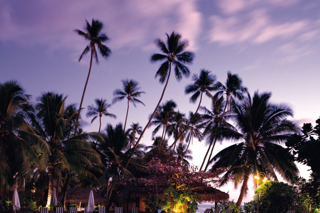
They say a picture speaks a thousand words, and this is so true with travel websites.
If you are selling something specific (tour operators for example) try not to use generic stock photos; yes your walking tour may go to Machu Picchu, but mixing in a few pictures of people hiking the Inca Trail will let people relate to the experience far more than just photos of the destination, after all if they wanted to see it they could jump on a bus rather than walking for days, in this example the walk itself is the majority of the holiday.
Sometimes it’s not always what you say, or even how you say it...
If you’re tour operator looking for high-end customers then your website need to reflect this. I won’t publically shame anyone, but I’ve seen travel websites selling holidays for up to $50,000 which look like they’ve been designed as a school project. On the other side of the fence, how many times have you seen a product or service but not asked for a price because “it will be too expensive”? It works both ways.
To make people trust you, and therefore choose you over their competitors, you really need to get in to their shoes, and show them exactly what they need to see. You don’t need to tell them why to choose you; you need them to decide this for themselves through all of the little details that you have presented to them.
We always see our own websites differently to the way other see them, so sometimes a fresh set of eyes is a good way of getting to the bottom of what needs to be improved. And of course, that’s where we come in. If you’d like us to look at your website, just give us a call.
The Travel Web Design Blog


