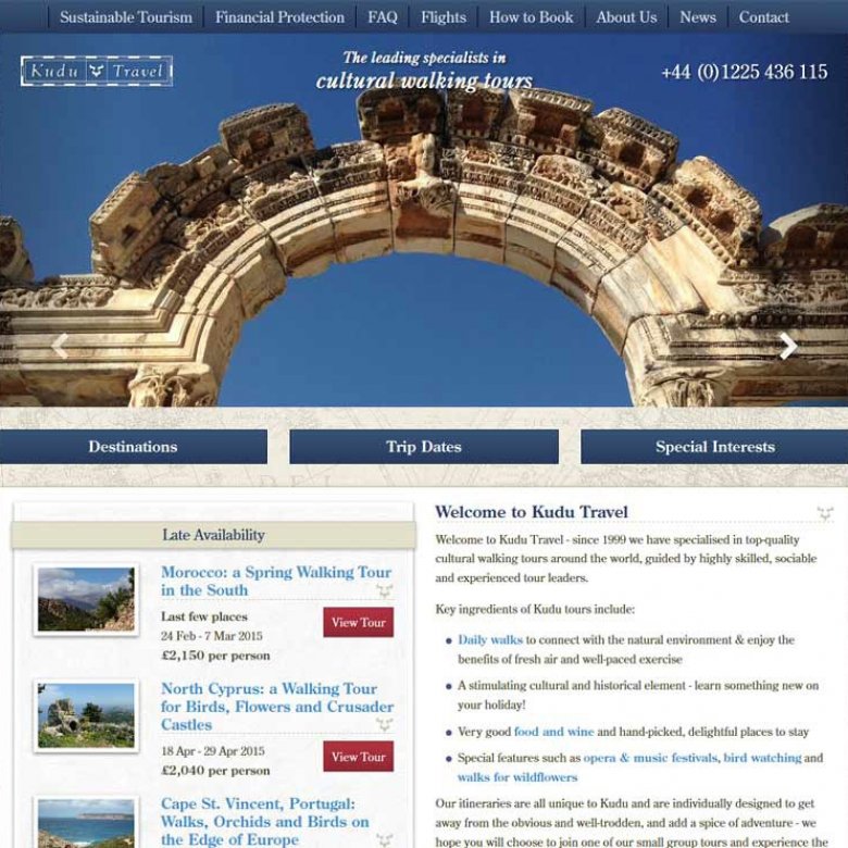
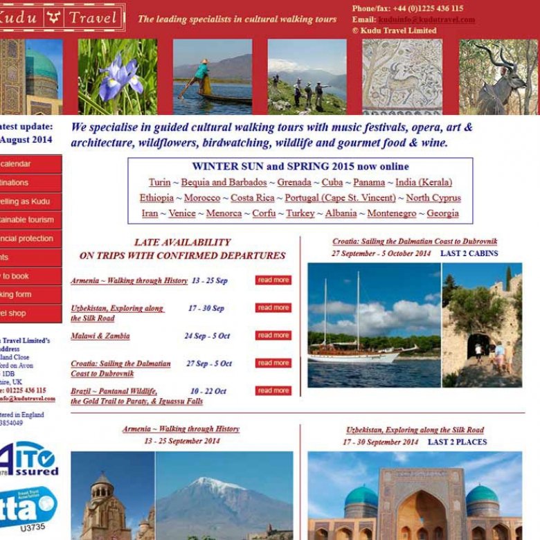
Kudu Travel, a specialist travel company, had a website that they had been using for years and was looking dated. They wanted to improve the engagement of their visitors and really show off their unique tours in order to boost online (and offline) sales.
The website can be found at: www.kudutravel.com
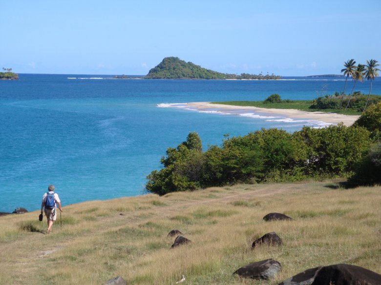
Reducing and removing any barriers preventing visitors from making a booking is one of the most important parts of any tour company website design. To this end, we focussed on making sure that there were prominent calls to action compelling visitors to enquire and book tours. We also streamlined the steps a visitor would have to follow to find the information they are looking for. A clear, structured layout of the tours ensured that people could easily see the key facts about each tour without overwhelming them with information. We used high quality photos from their tours to really immerse the viewer in each destination.
From the perspective of the business, filling up partially booked tours is particularly profitable. We designed the home page to draw attention to late availability tours that were partially filled.
The results
Two months after launch it's clear to see the impact the newly designed website has had; the bounce rate (where visitors leave after looking at the first page) has dropped tenfold. Visitor engagement has increased heavily as shown by the number of pages viewed by visitors increasing 300% and visitors spend 50% longer on the site viewing tours.
The Travel Web Design Blog


