Kudu Travel is a unique tour operator offering cultural walking tours across the world. They recently approached us to redesign their website so it could perform at a better standard and generate more bookings.
Our solution was a beautiful and highly functional website with improved usability, enhanced visitor flow and effective SEO (Search Engine Optimisation) techniques at its heart.
Intelligent website design
Here at The Travel Web Design Agency we specialise in tour operator’s website design, having a unique understanding of the travel industry from the inside, as well as from the customer’s position. Successful website design for travel and tour operators is distinctive and different from most other sectors – holidays are special occasions which are well researched by the customer and don’t come cheap. An effective travel website will sell the holiday experience to the high-value visitor in a short space of time, converting them into a paying customer (see How does travel website design differ from other website design?).
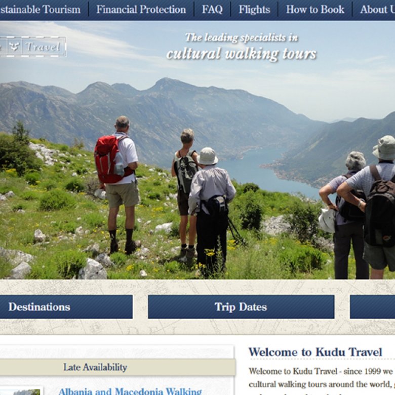
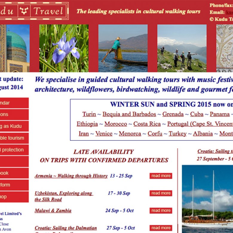
The first port of call for Kudu Travel was the homepage. Their existing website packed a lot of information into a limited screen space and was generally cluttered. The new homepage takes a more effective and efficient approach. The large, high quality imagery instantly instils the sense of culture and wonder, enticing the visitor to explore further. Directly below the image are the three main call-to-action buttons so the visitor can easily navigate to the tours of interest with minimal effort.
The tour page is one of the most important pages on the website; it can either turn people off, so they go and browse elsewhere, or it can arouse the imagination, inspire confidence and convert the visitor into a paying customer.
As with the homepage, it was important to make effective use of high quality imagery which serves as a far more potent tool for selling the tour experience to the visitor than blocks of descriptive text.
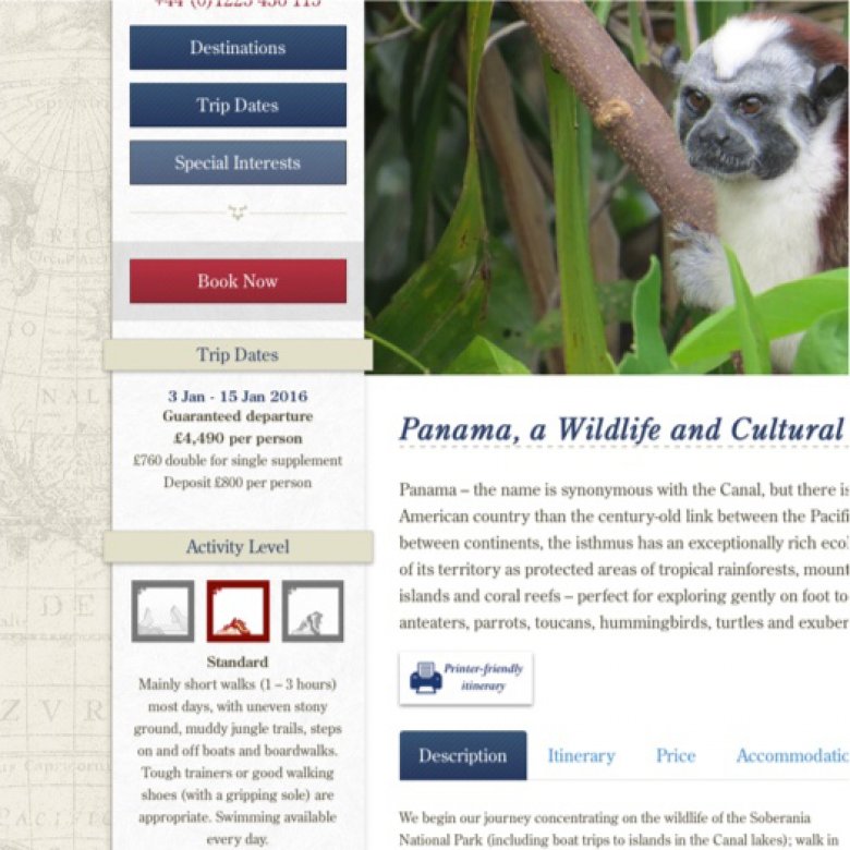
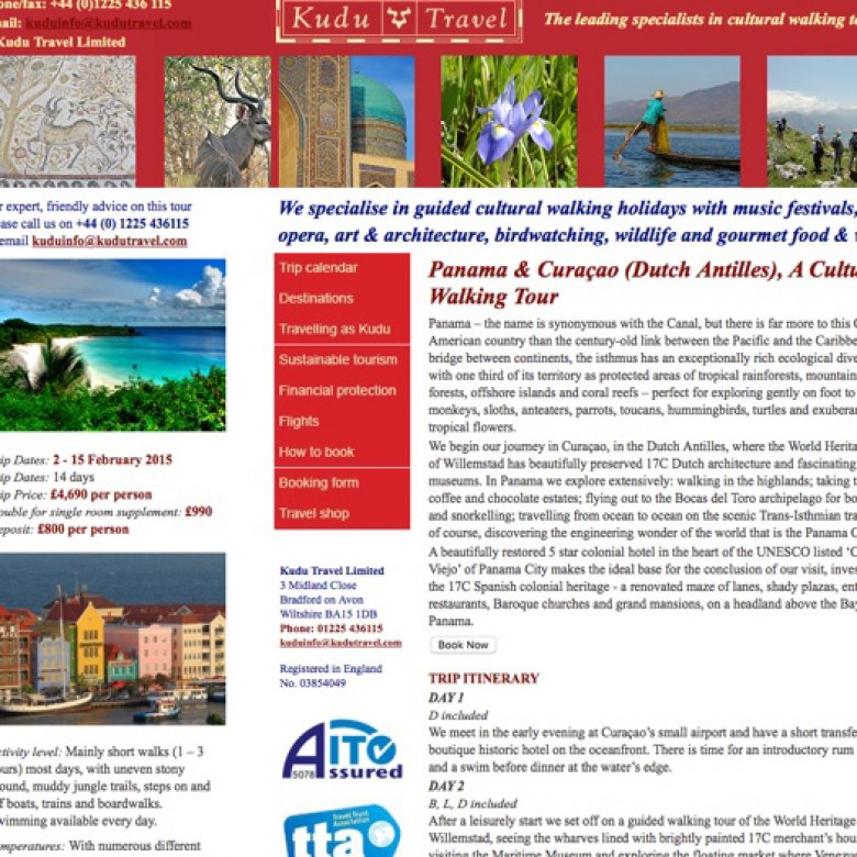
Important information regarding the tour is quickly and readily available on the left-hand-side, such as trip dates, price, activity level and special interests. In short, within a few seconds of landing on the page it is possible to know the important tour information, allowing the visitor to make the quick decision of whether the tour is suitable or to continue to browse the site for another.
The most important call-to-action on the tour page is the booking button. On the existing website the booking button was small, standard HTML button which had a similar background to that of the page. Contrast this with the booking button on the new website which is large, prominent and has a red background which stands out on the neutral background of the page. Everyone who visits the page has their attention drawn to the booking button and it’s in a standardised position on every tour you visit.
Another significant change we made to improve the conversion rate was to drastically reduce the amount of information a person has to enter when initially booking a tour with Kudu Travel online. Asking for lots of initial information, some of which they may not have readily accessible to them, can break the conversion and lose you that customer. Instead we now ask for the additional information after the booking has been made, thus removing the obstacle.
Optimising the website for search engines
While the design changes we’ve already outlined has successfully improved conversion rates, it would have been of little benefit if there wasn’t a steady footfall of potential customers to the website who are looking for what Kudu Travel has to offer. This is where search engine optimisation (SEO) comes in.
All of our travel and tour operator’s websites are designed and developed with search engine performance in mind. Our SEO specialists sit and engage with our designers and developers to ensure every aspect of the website is crafted so it will perform as expected in search engines, by implementing the very latest and most effective SEO techniques.
For Kudu Travel this didn’t just mean a full review of the content, navigation structure and site performance, but also a design which worked perfectly for all visitors, whether they were viewing the website on a desktop computer, tablet or Smartphone. You see, not only is having a mobile-friendly website important for optimal user experience (mobile traffic is set to overtake traditional desktop traffic), but Google has also started using mobile-friendliness as a ranking factor so having a mobile-friendly website helps a website perform better in Google.
As it was the case with Kudu Travel, when it comes to getting more traffic to your website with the help of SEO, and then converting as many of those visitors to customers with an effective web design, you need an integrated, intelligent approach and this is where The Travel Web Design Agency comes in.
We are The Travel Web Design Agency and we uniquely provide website design for tour operators.
The Travel Web Design Blog

